How to design newsletters that don't tank deliverability
 Priya IyerSeptember 5, 2026
If you've ever wondered how to design newsletters that actually get read, here's the uncomfortable truth: most newsletter design advice stops at the wrong layer. It tells you which fonts to pick, how to place your CTA button, and why you should use your brand colors consistently. All useful. None of it explains why a beautifully designed newsletter can still crater your sender reputation the moment you hit send.
Newsletter design is a two-layer problem. The visual layer — layout, typography, images, color — is what most guides cover. The infrastructure layer — list quality, bounce rate, inbox placement — is what most guides skip entirely. Get the first layer right and ignore the second, and you've built a gorgeous vehicle with a blown engine.
This post covers both. By the end, you'll know the structural decisions that separate high-performing newsletters from pretty ones, the typography and layout rules that actually matter across Gmail, Outlook, and Apple Mail, and exactly why a newsletter redesign is the highest-leverage moment to also clean your list.
Why design is doing more work than you think
75.4% of consumers say they prefer email for brand promotions. But 49.2% open only a handful of brand emails per day — which means your newsletter is competing in a very crowded inbox for a very small window of attention.
Readers decide in under three seconds whether to read or delete. That decision happens before they've processed a single word of your body copy. It happens when they scan the subject line in their inbox list, glance at the preheader, and — if they open — register whether the email looks trustworthy in the first screenful.
This is where most newsletter design advice goes wrong. It treats design as an aesthetic exercise: make it look good, match your brand, use nice images. But the real function of good newsletter design is to signal trust, consistency, and effort before the reader commits to reading. A cluttered layout says you don't respect their time. An inconsistent header says you're not a serious sender. A wall of text says you haven't thought about how people actually read on screens.
The difference between a pretty newsletter and a high-performing one is structural, not aesthetic. Structure is what guides the eye. Aesthetics is what makes the guided journey pleasant. You need both, but structure comes first.
Start with structure, not colors
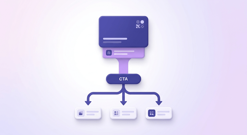
Before you open any design tool, answer one question: what is the single action you want the reader to take? Not two actions. Not a primary and a secondary. One.
This is the single-focus principle, and it's the most ignored rule in newsletter design. Newsletters with one primary CTA consistently outperform multi-topic blasts on click-through rate. The reason is simple: every additional link you add splits the reader's attention and reduces the probability they act on any of them.
Inbox Collective's "one link" experiment — where they stripped newsletters down to a single clickable element — found that click rates climbed even as the total number of opportunities to click dropped. Fewer doors, more people walking through the one that's open.
Once you know the action, map your content hierarchy around it:
- Primary story — the reason this email exists
- Supporting context — the detail that makes the primary story credible or urgent
- CTA — the one action that follows naturally from the above
- Secondary links — only if they genuinely serve readers who've already acted (or decided not to)
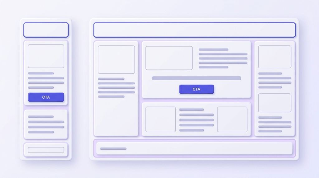
Layout follows from this hierarchy. Single-column layouts work for most editorial newsletters because they impose a natural reading order — top to bottom, one idea at a time. Multi-column layouts work for digest-style newsletters (think a weekly roundup with five separate stories) where the reader is expected to scan and pick. The mistake is choosing layout based on what looks impressive rather than what matches how your content is structured.
The five structural elements every newsletter needs
Good newsletter design isn't about adding elements — it's about making each of these five work correctly.
Subject line and preheader. Design starts before the email opens. The subject line and preheader text are the first visual experience your subscriber has. Most email clients show 40–60 characters of subject line on desktop and 30–40 on mobile. Your preheader is 85–100 characters of prime real estate that most senders waste by letting their ESP auto-populate "View this email in your browser."
Header. You have roughly one second to confirm brand recognition. Logo placement (top-center or top-left), a consistent background color, and a single brand typeface are all it takes. The header isn't the place to be clever — it's the place to be immediately recognizable.
Body layout. Whitespace is not wasted space. It's the mechanism that separates ideas and gives the eye a place to rest. Use consistent section breaks — a thin horizontal rule, extra padding, or a background color shift — to signal transitions between content blocks. Heading rhythm matters: if your H2s look like your body copy, readers lose their place.
Call-to-action. Buttons outperform text links for primary CTAs in most contexts — they're scannable, tappable on mobile, and visually distinct. Place your primary CTA above the fold when possible (within the first screenful on mobile). High contrast between button color and background is non-negotiable: a lavender button on a white background disappears. If you use a secondary CTA, make it visually subordinate — smaller, different color, or text-link format.
Footer. A well-designed footer reduces spam complaints. That's not a design opinion — it's a deliverability fact. Your footer needs a physical mailing address (legally required under CAN-SPAM and GDPR for commercial email), a visible unsubscribe link, and a one-line reminder of why the subscriber is receiving the email. Readers who can't find the unsubscribe link hit "Report Spam" instead. That complaint goes on your sender record.
Typography and color: the rules that actually matter
Custom fonts are a trap for email designers. Embedded web fonts render beautifully in Apple Mail and some versions of Outlook — and fall back to Times New Roman (or whatever the system default is) everywhere else. Unless you're designing exclusively for Apple Mail subscribers, build your typography around system-safe web fonts: Georgia, Arial, Helvetica, Trebuchet MS, Verdana. They're not exciting. They render.
If you do use a web font, always declare a fallback stack: font-family: 'Your Font', Georgia, serif;. The font renders where it can; the fallback carries the design where it can't.
Minimum body copy size: 16px. Not 14px. Not 13px. Anything smaller than 16px on mobile requires pinch-to-zoom, and readers who have to zoom out. Line height for body copy should sit between 1.4 and 1.6. Paragraph width should max out at 600px — the standard newsletter container width — which gives you roughly 65–75 characters per line, the range where reading speed peaks.
Color contrast is both an accessibility requirement and a conversion lever. WCAG AA minimum is a 4.5:1 contrast ratio between text and background for body copy. Tools like WebAIM's contrast checker will give you the ratio in seconds. The reason this matters for conversions: low-contrast text reads as low effort. High-contrast text reads as intentional.
Limit your palette to 2–3 brand colors. One primary (your brand color, used for CTAs and accents), one neutral (white or off-white for backgrounds), and one secondary (for section breaks or secondary elements). More than three colors creates visual noise that competes with your content. Pick the palette once and apply it consistently across every send.
Images: when to use them and when to cut them
Here's the image-blocking problem nobody talks about: 43% of Gmail users view emails with images disabled by default. That means nearly half your Gmail audience sees your carefully chosen hero image as a blank white rectangle — unless you've written the alt text.
Alt text isn't just an accessibility checkbox. In email, it's a conversion mechanism. Write alt text as if it's the only text the reader will see in that space: not "newsletter hero image" but "The three-step framework that cut our bounce rate in half — read below." If the email converts without images, it converts everywhere.
Hero images perform well for product-focused newsletters where the visual is the message (fashion, food, design). They perform worse for editorial and B2B newsletters, where the text is the product. Test it on your specific audience rather than copying the convention from a newsletter in a different category.
Gmail clips emails that exceed 102KB of HTML. A single unoptimized image can push you past that threshold, which means subscribers see a "[Message clipped] View entire message" link — and most don't click it. Keep individual images under 200KB, optimize with tools like Squoosh or TinyPNG before uploading, and host them externally (not as inline attachments).
When in doubt, test a text-only version of your newsletter against your image-heavy template. For B2B and high-information newsletters, plain text frequently wins on CTOR (click-to-open rate) — not because images are bad, but because they slow load time and distract from the message.
Mobile-first layout decisions
More than 60% of email opens happen on mobile. If you're designing for desktop first and adapting for mobile as an afterthought, you're designing for the minority and hoping the majority forgives you.
Mobile-first means: design the single-column, full-width layout first. Then scale up to desktop by adding margins and max-width constraints. This direction works because a single-column layout survives the desktop transition — it just gets wider margins. A multi-column desktop layout breaking into stacked columns on mobile often produces orphaned elements, misaligned buttons, and text that's too small to read.
Tap target sizing: any button or linked image needs a minimum tap target of 44×44 pixels. This is Apple's Human Interface Guideline and Google's Material Design recommendation — both based on the average adult fingertip width. A 20px text link that's technically clickable is practically untappable on a phone.
Responsive email CSS is possible — media queries work in most modern email clients — but Outlook (desktop versions) ignores them entirely. The safe pattern is to design a layout that works without any responsive adjustment, then enhance with media queries for clients that support them. If your base layout requires a media query to be usable on mobile, the base layout is the problem.
Preview tools like Litmus and Email on Acid are useful for catching rendering bugs across client versions. But they're not a substitute for testing on real devices. Send to yourself. Open on an actual iPhone and an actual Android. The preview is a simulation; the device is the truth.
Choosing the right design tool for how to design newsletters
The tool you pick matters less than the workflow you build around it. That said, the options fall into three categories with genuinely different tradeoffs.
Template-first tools (Canva, Adobe Express)
Fast to start, constrained by design. Good for small teams without HTML skills who need a polished result quickly. The constraint is the feature — you can't accidentally break the layout. The limitation is the same: you can't fully customize it either. Best for newsletters where visual consistency matters more than structural control.
ESP native editors (Mailchimp, Klaviyo, MailerLite)
Drag-and-drop builders built into the platforms you're already sending from. The advantage is direct integration — design and send in one place, with built-in mobile preview. Mailchimp, Klaviyo, and MailerLite all have solid native editors. The limitation: they generate bloated HTML that can push you toward Gmail clipping if you're not careful.
Code-first approaches (MJML, raw HTML)
Maximum control over every pixel. MJML compiles down to responsive, cross-client-compatible HTML and is the most reliable way to produce a newsletter that renders correctly in Outlook 2016 and Apple Mail simultaneously. Steep learning curve. Worth it if you have a developer on the team and send at volume.
Start from a template if you're launching a newsletter for the first time — iteration speed matters more than perfection. Build from scratch when you've validated your audience and you're hitting the ceiling of what templates can do. The moment most people miss: whichever tool you choose, it does not verify the list you're sending to. That's a separate problem, and it's the one that can undo everything else.
Testing and iterating your newsletter design
A/B testing is only useful if you change one variable at a time. Testing a new subject line, a new CTA color, and a new layout simultaneously tells you that something worked — not what. Pick one: subject line first (highest impact on open rate), then CTA placement (highest impact on CTOR), then layout (hardest to isolate cleanly).
Open rate is a misleading metric for design decisions. Apple Mail Privacy Protection inflates open rates for Apple Mail users by pre-loading tracking pixels. Click-to-open rate (CTOR) is the metric that actually reveals design performance: of the people who opened, what percentage clicked? A low CTOR with a healthy open rate means your email is getting opened but not converting — that's a body copy and design problem, not a subject line problem.
Heat mapping tools for email — Mailchimp's click maps, Klaviyo's heatmaps, or dedicated tools like Litmus Analytics — reveal scroll depth and click distribution. If 80% of clicks are on the first link and zero clicks are on the CTA below the fold, you know the fold is the problem, not the CTA itself.
Here's the design signal most people misread: a spike in bounce rate or spam complaints after a redesign isn't always a design problem. It's often a list quality problem that the redesign exposed. A new template with a new from-name or a new sending domain triggers re-evaluation by inbox providers — and if your list has accumulated invalid addresses, role addresses, and spam traps in the meantime, that re-evaluation goes badly. More on this in the next section.
The CTOR benchmark to aim for
A healthy newsletter CTOR sits between 10–15% for most B2B and editorial newsletters. Below 8% consistently means something in the body — layout, CTA placement, or offer — isn't converting openers into clickers. Above 20% is excellent; if you're there, document what you did and repeat it.
The list quality problem most newsletter designers never think about
A beautifully designed newsletter sent to a dirty list still damages your sender reputation. This is the part of newsletter design advice that almost nobody covers, and it's the part that can make or break every other decision you've made.
Hard bounces above 2% signal to inbox providers — Google, Microsoft, Yahoo — that your domain is unreliable. Once that signal is in their systems, inbox placement drops across your entire list, not just for the bad addresses. You can read more about the mechanics in the email deliverability guide, but the short version is: inbox providers use your bounce rate as a proxy for how carefully you manage your list.
Role-based addresses (info@, admin@, support@) are a subtler problem. They're often real addresses that accept mail — so they don't bounce — but they're shared inboxes with low individual engagement. High role-address density inflates your list size while suppressing your engagement rate, which inbox providers also track. Similarly, invalid addresses that haven't started bouncing yet (recently abandoned accounts, for example) will start bouncing at the worst possible moment: when you hit send on your redesigned template to your full list.
A newsletter redesign is exactly the right moment to verify your list. Here's why: you're already investing time and resources into a new template. You're about to send to everyone. If there was ever a send worth protecting, it's the one where you're trying to make a strong first impression with new creative. Launching a polished new design to a dirty list is the fastest way to tank the deliverability gains good design is supposed to produce.
Check an address before it gets on your list
Paste any email address to see its 11-stage verification result instantly.
Powered by Valid Email Checker — full SMTP handshake, disposable + role detection, no card required.
What does verification tell you beyond bounce rate? It tells you the composition of your list. Valid Email Checker's 11-stage engine classifies every address into one of ten statuses — safe, risky, invalid, unknown, catch-all, disposable, role, spamtrap, disabled, or inbox-full. The mix of those statuses tells you whether your list has a spam trap problem (a sender reputation emergency), a role-address problem (an engagement problem), or a disposable-address problem (a signup quality problem). Each requires a different fix. You can read the full breakdown at every result type, explained.
For a deeper look at what each verification status means and how to act on the results, the 10 email verification statuses explained guide covers every classification in detail. And if you want to understand the mechanics of the verification pipeline itself, how email validators work walks through all 11 stages.
The practical sequence: export your full subscriber list, run it through verification, suppress everything classified as invalid, spamtrap, or disabled, and treat role and disposable addresses as a separate decision (suppress or segment, depending on your list size and risk tolerance). Then launch your redesigned newsletter to the verified remainder. Your bounce rate stays below 2%, your sender reputation stays intact, and the design work you've done actually reaches inboxes.
To check your newsletter's deliverability score before the redesign launch, run a pre-send check — it catches authentication gaps (SPF, DKIM, DMARC) that affect inbox placement independently of list quality. Both layers need to be clean. See also why emails go to spam for the full picture of what inbox providers look at.
Free tool · no signup
Test your newsletter before the redesign launch
Score your email against spam filters, authentication checks, and inbox placement signals — before it goes to your list.
Free tool · no signup
Run a deliverability check on your sending domain
See how inbox providers score your domain before your redesigned newsletter hits send.
Frequently asked questions
What's the ideal width for a newsletter email design?
How many images should a newsletter have?
What fonts are safe to use in email newsletters?
How do I make my newsletter design mobile-friendly?
Should I use a template or design my newsletter from scratch?
How do I know if my newsletter design is hurting deliverability?
What's the best call-to-action placement in a newsletter?
How often should I redesign my newsletter?
Good newsletter design earns attention. Clean list hygiene makes sure that attention is possible in the first place. The redesign you're planning is the right moment to handle both — verify your list before the new template goes live, and the design work you've done actually reaches the inboxes it's built for. The tool below handles the verification side.
Try Valid Email Checker free
Verify any email in under a second
Get 150 free verifications. No credit card. Auto-refund on every Unknown result — the only verifier we know that does this.
- 150 free credits when you sign up
- Auto-refund every Unknown verification (we're the only ones that do)
- 11-stage flow catches what 1-step checkers miss
- Drop-in integrations for Mailchimp, HubSpot, SendGrid, 14 more
Written by
Priya IyerPriya writes about the human side of email — how you word it, when you send it, and how to grow a list without wrecking your deliverability. From sign-offs and subject lines to lifecycle automation and list hygiene, she's after email that respects the reader's inbox and still gets results. Her north star: more opens and replies, fewer unsubscribes and spam complaints.